The novel design approach embraced by Whine Co. is projected to resonate powerfully in a market filled with traditional offerings. The combination of solid matte-colored bottles, bold abbreviated names, and poetic descriptors is designed to create a striking visual appeal. These distinctive elements are not only aligned with modern tastes but are also expected to lure discerning consumers, enhancing the brand’s visibility and appeal. The success of this strategy hinges on its ability to blend innovation with tradition, providing a fresh perspective on wine that invites exploration. It’s anticipated that Whine Co.’s commitment to quality and modern aesthetics will translate into strong brand recognition and consumer affinity, setting the stage for a successful market launch.
Whine Co., an emerging wine company, sought to create a distinctive brand identity that would echo the singular essence of their diverse wine offerings – Rosé, Pinot Grigio, Chardonnay, Pinot Noir, and Malbec. Driven by a vision to craft a bottle that would truly stand out, they aimed to combine innovative packaging design with a unique and impactful brand presence. This ambitious goal was set to ensure that Whine Co. would not only be recognized but also be a memorable and unparalleled force in an increasingly competitive market space.
Starting with a detailed brand workshop, we embarked on a journey to identify the essence of Whine Co., their values, their ideal customers, and their vision for their wines.
We worked closely with Whine Co. to craft a brand narrative with a modern twist. Aligning with their vision, values, and passion for wine, our approach focused on delivering a unique blend of innovation and elegance that resonates with today’s consumers.
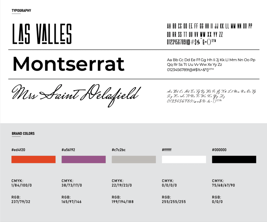
Brand Identity: We created a clean, minimalist aesthetic that matched the elegance of the Whine Co. brand and their wines. Our custom font design embodied simplicity and class, providing a unified look across all brand touchpoints.
Visual Identity and Custom Font Design: The visual identity was designed to be both contemporary and timeless. We employed a clean, minimalist font design, reflecting the sophistication of the Whine Co. brand. This simplicity spoke to the modern consumer while maintaining a high-end feel across all branding materials.
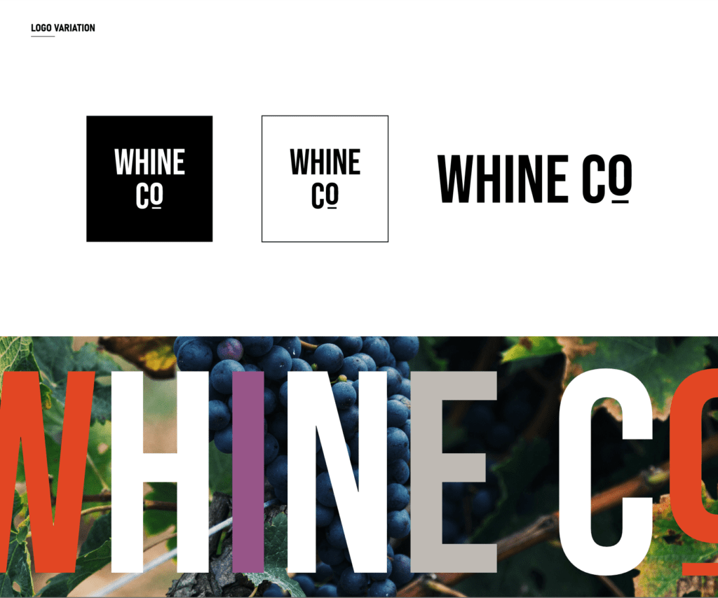
Logo Design: In line with the minimalist approach, the logo featured a sleek and minimalist “W” that encapsulates Whine Co.’s innovative spirit. This subtle yet striking design element serves to increase brand recognition, mirroring the company’s forward-thinking approach.
Color Consulting: Careful consideration was given to the colors, each chosen to resemble the colors of each wine offering. From the crispness of Pinot Grigio to the deep richness of Malbec, the chosen colors added visual depth, reflecting the unique character of each wine, while the overall palette contributed to a unified and distinct brand presence.
In a marketplace dominated by traditional wine bottlings, Whine Co. sought to create a distinctive presence. We devised a unique approach that blends the use of solid matte-colored bottles with abbreviated wine names, expressed in large, bold fonts to catch the eye of contemporary consumers. This fusion of traditional wine culture with a modern twist creates a vivid stand-out effect on the shelves. By encapsulating the essence, flavors, and emotions of each wine with single words featured on the bottles, we’ve crafted an innovative visual experience that aligns with Whine Co.’s commitment to quality. The resulting design resonates with modern wine enthusiasts and enhances the brand’s visibility, reflecting a forward-thinking aesthetic.
Rosé: This wine’s gentle nature is mirrored in a muted pink matte bottle, reflecting the delicate character and refined charm intrinsic to Rosé.
Pinot Grigio: Presented as “Pinot G,” the light beige matte bottle bridges the gap between traditional appeal and modern sensibility, mirroring the wine’s versatile nature.
Chardonnay: Abbreviated to “Chard,” the creamy bright matte yellow bottle resonates with the vibrant and rich qualities of this wine, symbolizing its freshness and complexity.
Pinot Noir: Simplified as “Pinot N,” this wine is elegantly housed in a matte muted purple bottle. The choice of color subtly communicates the wine’s light, smooth taste, allowing the wine’s inherent qualities to shine.
Malbec: Packaged in a striking black matte bottle, Malbec’s design emphasizes its robust and intense flavors, perfectly aligning with the wine’s full-bodied experience.
The novel design approach embraced by Whine Co. is projected to resonate powerfully in a market filled with traditional offerings. The combination of solid matte-colored bottles, bold abbreviated names, and poetic descriptors is designed to create a striking visual appeal. These distinctive elements are not only aligned with modern tastes but are also expected to lure discerning consumers, enhancing the brand’s visibility and appeal. The success of this strategy hinges on its ability to blend innovation with tradition, providing a fresh perspective on wine that invites exploration. It’s anticipated that Whine Co.’s commitment to quality and modern aesthetics will translate into strong brand recognition and consumer affinity, setting the stage for a successful market launch.